The AI-powered Data Migration Tool automates legacy-to-modern data transfer, reducing manual effort, costs, and migration time by 50%, ensuring a faster, seamless transition with minimal developer workload.
My role
Lead end-to-end process, established brand, conducted UX research, developed scalable design systems, and ensured delivery.
Team
3 UX designers, 3 UI designers
Duration
8 weeks
Tools used
Axure, Confluence, miro, Jira, Sketch, Zeplin, Invision
Project context
Organizations worldwide are migrating from legacy systems to modern platforms, but the data migration process is complex, costly, and time-consuming, leading to business losses and reduced ROI. Deloitte Digital aimed to enable secure and efficient migration for its Fortune 500 clients, but existing methods were manual, slow, and error-prone.
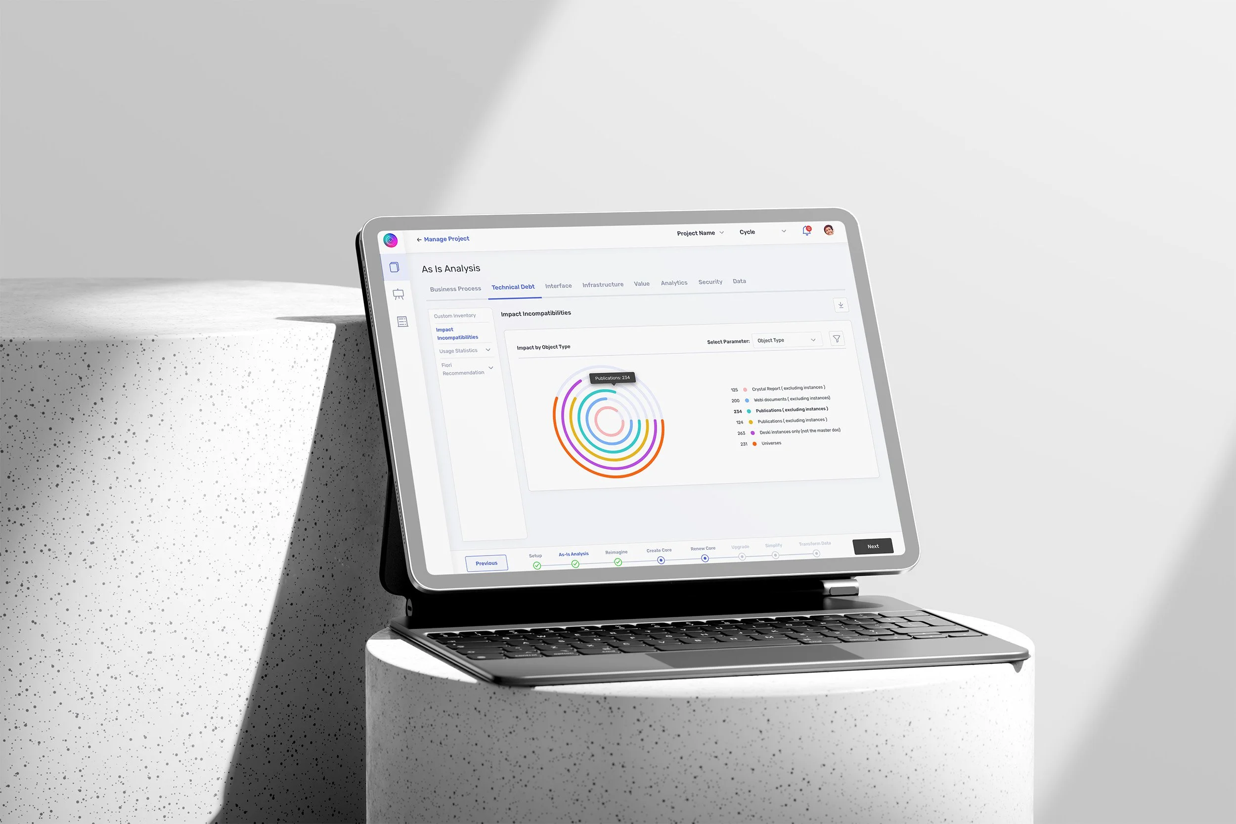
Our team conducted a design exercise to improve the migration process with an affordable data structure and better user experience. We identified key loopholes in usability, architecture, and efficiency, which hindered ROI. By automating and optimizing the process, we reduced manual complexity, costs, and delays, ensuring a seamless transition to advanced platforms.
Strategic Design Approach
Every design challenge requires a tailored process approach to identify key problems early and integrate continuous user feedback. Our design framework enabled us to tackle critical business questions through prototyping, testing, and stakeholder collaboration, ensuring efficient problem-solving within a defined timeframe.
Adaptive Process
Customized approach to fit unique project needs.
A consolidated project planning view helped the team adopt an agile approach, streamlining project deliveries within the stipulated time.
Early Problem Identification
Defined strategy to detect issues at the right phase.
To ensure a user-centric and seamless data migration process, we conducted a hybrid workshop involving both legacy and new system users along with key stakeholders. The workshop followed the 4C’s framework - Collect, Choose, Create, and Commit- to structure insights effectively
User-Centric Testing
Continuous feedback loops, including stakeholders, to prevent future project bottlenecks.
Agile Execution
Structured planning for timely and efficient project delivery.

User workshop
In-Person Session (Qualitative Research)
Open-ended discussions to uncover user pain points, latent needs, and emotional experiences during migration.
Online Survey (Quantitative Research)
Close-ended questions to analyze project statistics and high-level problem scope.


Insight
87% of users monitor migrations on weekends, 92% of projects face delays, and 70% of the workload falls on process leads. With 95% of users struggling due to an Excel background, automation, role optimization, and a more intuitive user interface are critical.
User study
This project integrated both legacy and new platforms, requiring a user-focused strategy. We categorized users into distinct segments based on their use cases, enabling a multi-persona product-building approach.
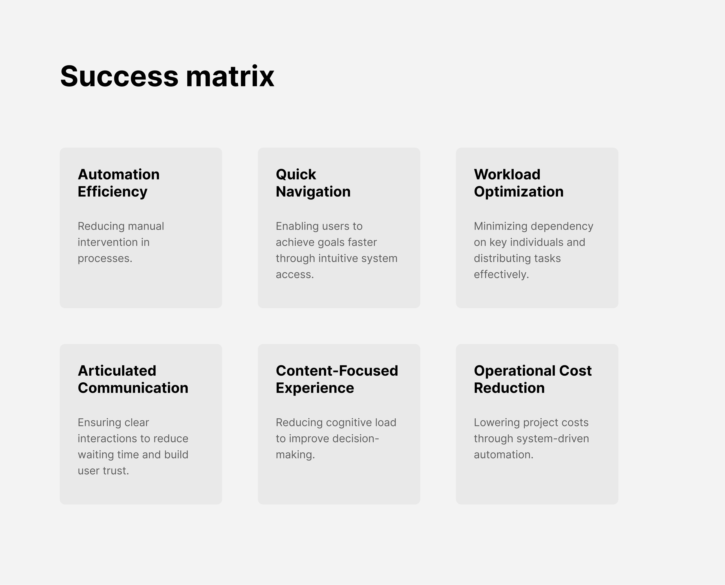
Through research insights and stakeholder collaboration, we developed a success matrix, aligning design value with business goals. This framework not only defined the project’s value proposition but also measured the ROI of design solutions, ensuring strategic impact and user-driven outcomes.

Insight
The study revealed delays in requirement gathering, reliance on process leads, and slow access to key functions, highlighting the need for automation, structured workflows, and system flexibility to improve efficiency.
Design Evolution
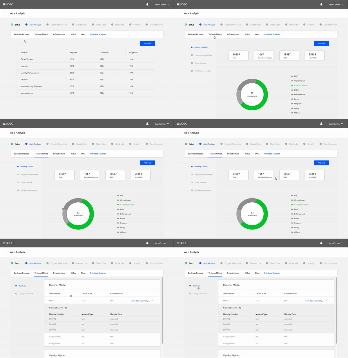
The journey began with user journey mapping to uncover key pain points, followed by quick prototyping and iterative feedback loops to refine solutions. Using an MVP approach, we continuously improved based on user insights.

Stakeholder collaboration ensured validation, trust, and seamless execution, aligning with business goals and user expectations.
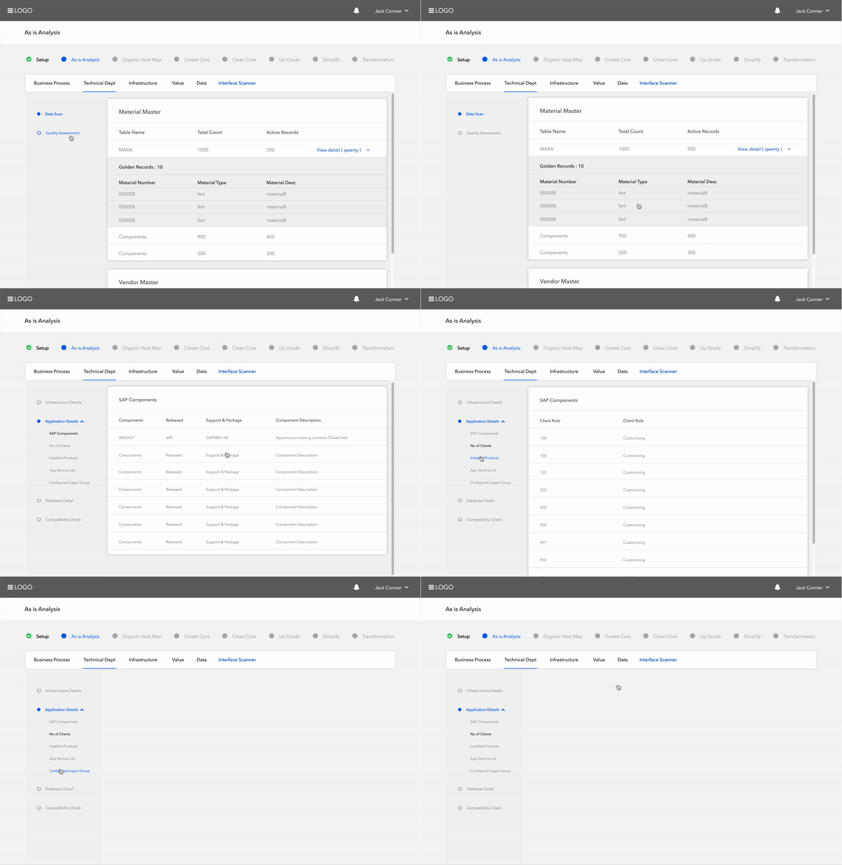
Insight & Design Decision
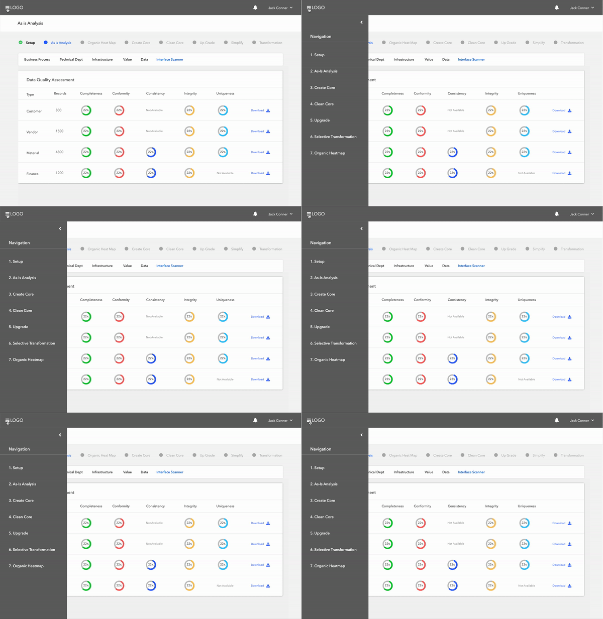
Navigation was key! Recognizing two distinct personas—admins and process leads—I mapped the workflow to ensure role-based navigation and timely communication. To streamline operations, I compartmentalized the workflow into administration & project management and data migration, ensuring seamless connectivity and responsibility alignment.
Design System Approach & Accessibility Parameters
To ensure consistency, efficiency, and scalability, I implemented an Atomic Design approach, building from small elements to complex components. The system adhered to Deloitte’s branding guidelines while maintaining a unique, modern look.
Designed for developer efficiency, it was first created in InVision and later transferred to Zeplin with code support for seamless integration.
Style Guide
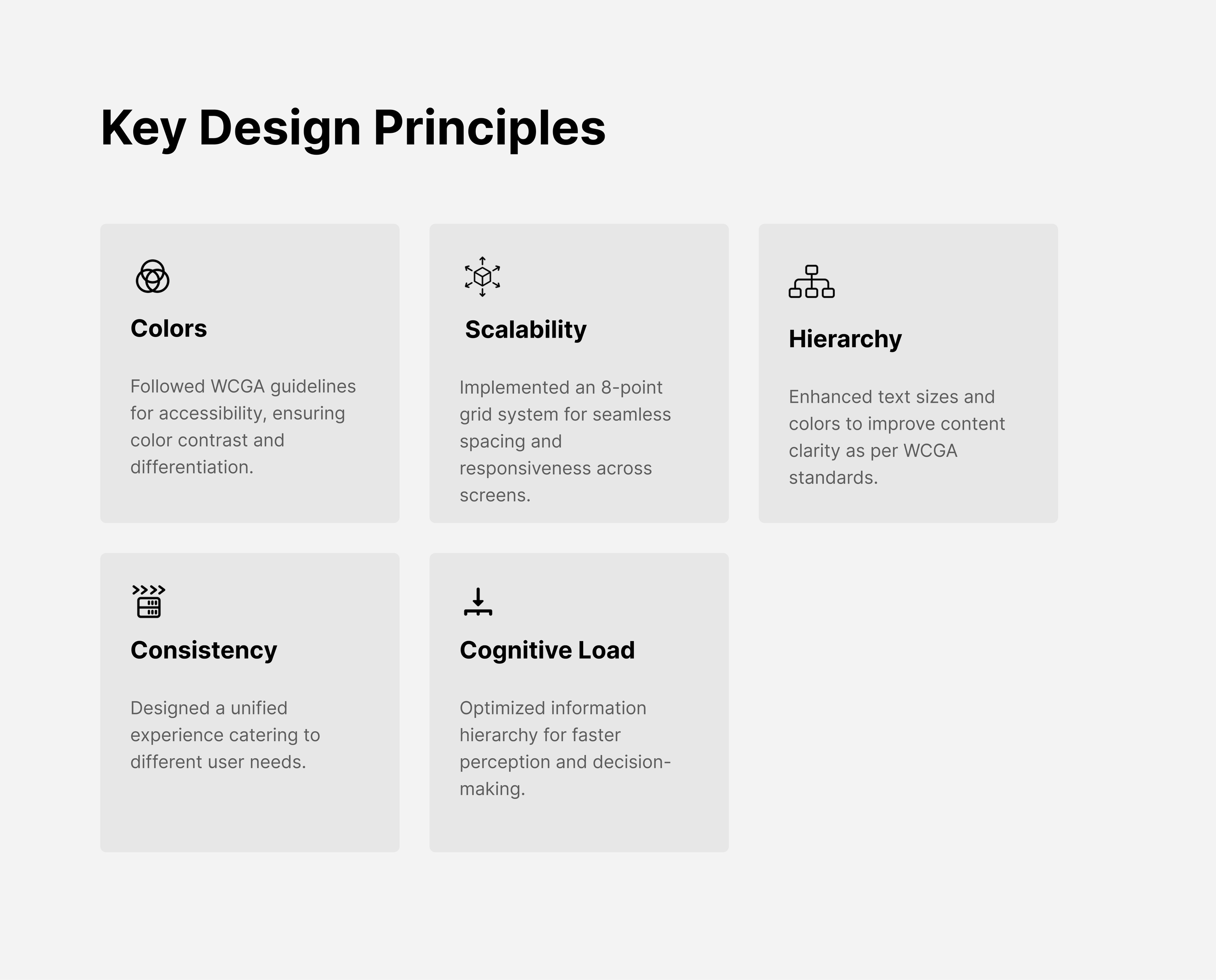
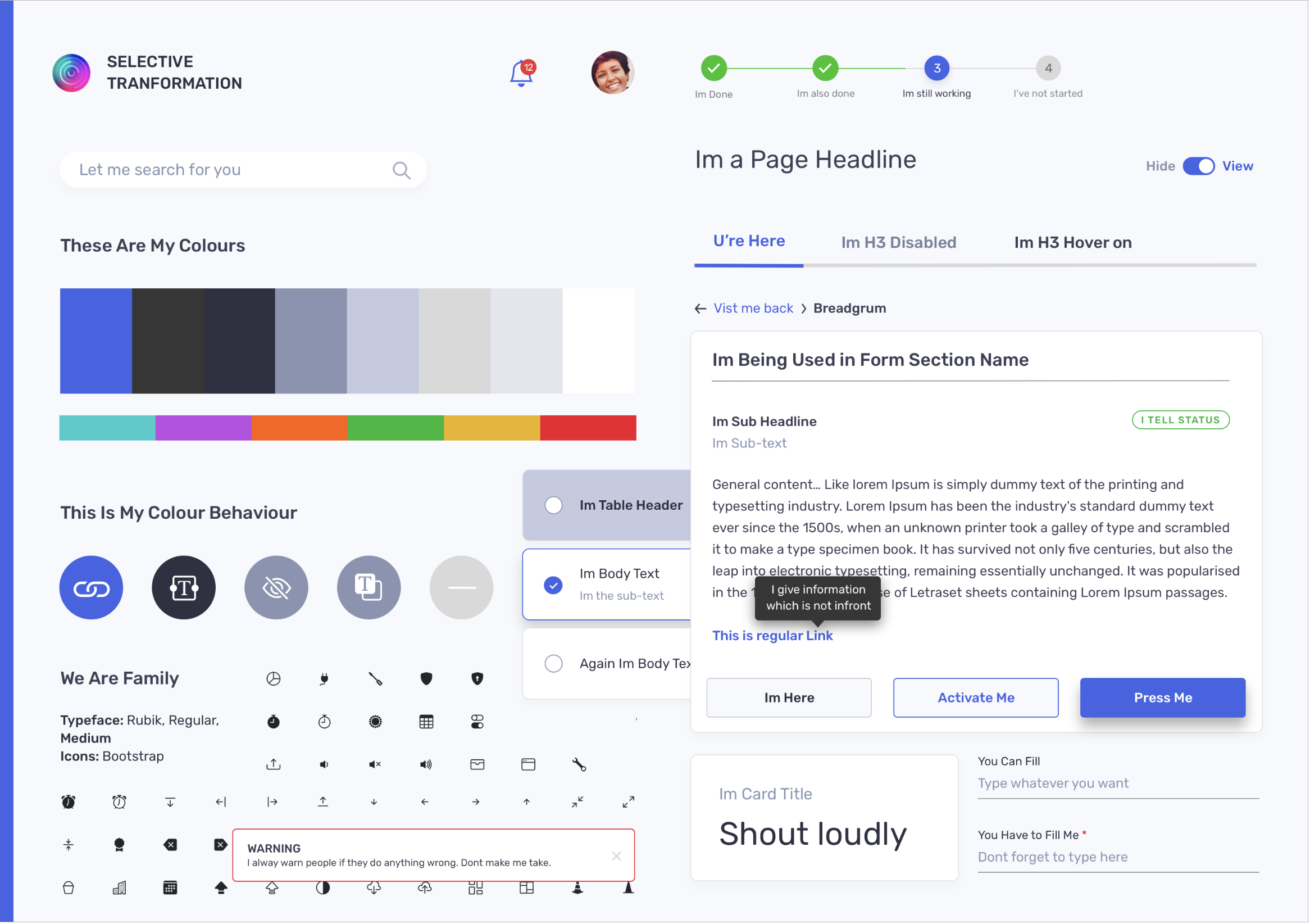
Following WCGA guidelines, we conducted brightness, contrast, and color tests to ensure optimal textual and non-textual visibility. A meticulously crafted style guide was developed to maintain scalability, consistency, and accessibility, aligning with pixel-perfect implementation and high-quality design standards.



Impact
The Data Migration Tool project exemplifies a strategic approach to modernizing enterprise systems. By focusing on migrating only essential data and processes, the project not only streamlined operations but also minimized unnecessary complexities. This targeted methodology has enhanced operational efficiency and aligned seamlessly with business objectives.
Final Thoughts
Design value
Post-implementation feedback indicates a significant reduction in manual workloads and improved user satisfaction. The design’s impact was assessed through user surveys and performance metrics, revealing:
The project’s success is highlighted by its feature on Deloitte’s official website, underscoring its significance and impact. The tool’s ability to facilitate a rapid transition to SAP S/4HANA on Google Cloud, potentially in as little as 16 weeks, showcases its efficiency and effectiveness.
50% decrease in manual data handling tasks
Users reported spending less time on manual interventions, allowing them to focus on more strategic activities.
40% improvement in data processing speed
The automation capabilities of the tool accelerated data migration processes, leading to faster project completions.
35% reduction in error rates
Enhanced accuracy in data migration minimized errors, contributing to more reliable system operations.
Learnings
Role-Based Navigation
Designed a dual-persona system for admins and process leads, ensuring shared structure with distinct responsibilities.
Scalable Workflow Design
Compartmentalized the process into administration & project management and data migration, enhancing clarity and scalability.
Early Prototyping Saves Costs
Iterative user feedback loops helped refine flows before development, preventing expensive reworks.
Achievements
Selective Data Migration
Leveraged AI-driven analytics to migrate only critical data, reducing time, cost, and system complexity.
